A Clean Writing Environment
I have simple preferences for writing:
- Clean canvas
- Easy to read and edit
I can happily type away as long as these broad goals are met. Emacs being a text editor many people use it for purposes other than coding. I will discuss the packages I use and explain my reasoning behind them.
Layout
We need to keep the width of body text in check for the readers—be it on the web or on printed media. This is also important while writing; if the lines are too long, they hinder thoughts and make it hard to follow consecutive lines. Having control here helps with reading—while writing & editing.
There are multiple ways one can approach this:
-
Reduce window size by using the mouse or trackpad to make the window smaller. With visual-line-mode or word wrap, the small window adjusts the effective body width of your text.
-
Use a package like olivetti-mode, which adjusts the body width in a way analogous to CSS. This method does not require you to resize windows and can be enabled or disabled at any time. I use
olivetti-mode.
Here is an example of resized window:
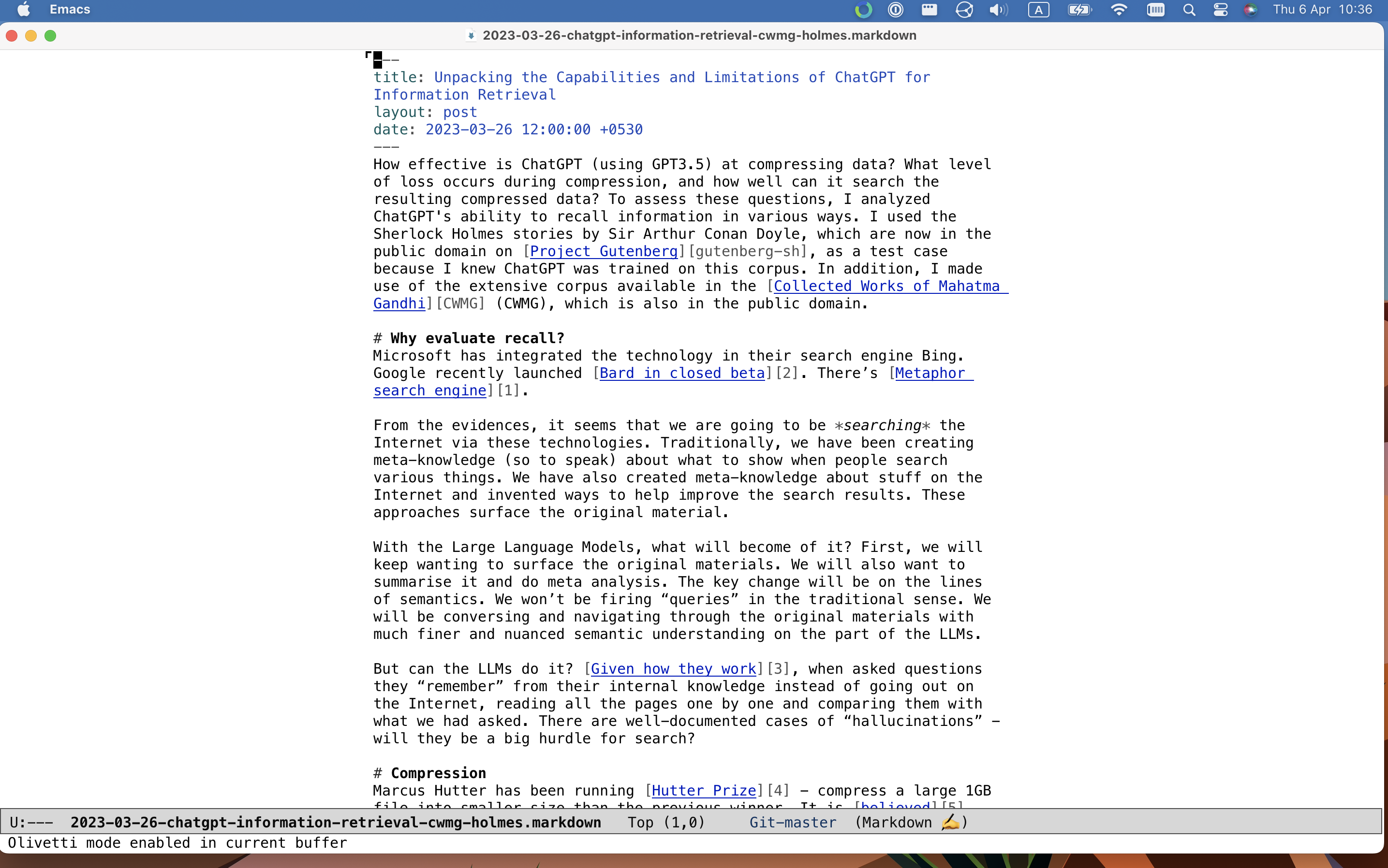
And this is olivetti-mode:
Before I started using olivetti, I used to enable auto-fill-mode, which inserts a carriage return (a newline) after a specified number of characters. It could have been useful in some other era, but I don’t see why I would want to insert newlines within my paragraphs. I rather treat paragraphs as a whole unit. I had to rely on, for example, jekyll’s markdown parser capabilities to make sure those newlines were removed when publishing to HTML.
Typography
Legibility of the written text is paramount. There are a few points worth considering here: fonts, ligatures, styling of typefaces, and ability to switch the settings.
I write the blog posts in markdown format. When Emacs displays markdown-formatted text, it applies styling on top. As you can see in the screenshots below, headers (lines starting with a #) are displayed differently from the body text, grave (the ` character) is highlighted differently, and so on. This helps with reading the document as I write.
I write notes in plaintext format and apply no formatting on top—they’re simple .txt files.
I use \(\LaTeX\) for some of technical writing, which I often export to PDF.
Usually, I use monospace fonts while writing. Mainly because I’m used to them from my programming activities. However, I am working on breaking this habit for prose writing because it is inducing bad behaviors such as relying on eyes to catch spelling and grammar mistakes instead of relying on actual tools.
Often I switch to proportional fonts while reading. Usually I am reading on MacOS and rely on SF Pro or Charter. Another important reason for switching fonts is scripts other than Latin (such as for Devanagari and other indic languages). Emacs support for these is not optimal, though it is acceptable, and I live with it.
The ligature rendering capability of a text editor is not that important for Latin, but it is important for many other languages. Emacs is improving on it. Normally I do not write much of non-Latin text except math. Thus, subpar ligature rendering doesn’t bother me much.
In general, selecting different fonts for different tasks is not easy in Emacs. For example, deciding which fonts will be used to display emoji and ligatures is hard-coded and frankly a bit weird to someone like me who barely understands the technicalities. Most success I’ve had has been on MacOS. Menlo and SF Pro fonts are able to handle a lot of scripts, making my life easier.
All of these typographic things look terrible on my 27-inch 1080p monitor because of its low DPI. The font curves are ugly, they don’t have consistency, the spacing is all wrong between characters. It is plain ugly. However, the text looks excellent on the HiDPI displays of the macbook and iPad. If you ask me, spare yourself from buying low DPI displays, choose a life of artisanal beauty.
Typography other than fonts is handled by the “major modes”. Like the markdown format example we saw above, major modes for different files apply different semantic styling to the displayed text. I have not had to tinker with these yet.
Mode line
Emacs has something called the “mode line”, which you’re probably familiar with if you’ve used code editors. It displays helpful information such as—the file you’ve opened; if the file has been edited since you last saved it; which type of file Emacs thinks it is (markdown, text etc) and other such things.
My needs are different when I’m writing code and when I’m writing prose. I clean up the mode line when writing prose by using diminish via use-package to hide away the minor modes. I disable display-time-mode - it displays current time, see the screenshots below.
This is how a cleaned-up modeline looks like:

This is the modeline while writing code:

There are a few modes I prefer knowing about such as olivetti. I have started experimenting with showing symbols (that is, emoji) in place of their text names in the mode line. Somehow, they communicate intent with me—“you are writing, have fun!” or “so many RSS feeds! Yay!”.
Decluttering the mode line is a simple change that adds to the clean canvas of the editor.
Notes
Writing notes helps me think. It is a way for me to be mindful of things, where I discuss matters with myself and see what my past selves were thinking about. As I’ve talked about before, I write lots of notes.
To ease things up with denote, especially for journaling, I have created a few wrappers.
With just three keystrokes, I can get a new journal file for the day using simple elisp code, as shown below:
(defun cq/create-denote-journal-entry ()
  (interactive)
  (let* ((date (org-read-date))
         (time (org-time-string-to-time date))
         (title (format-time-string "%A %d %B %Y" time))
         (initial (denote-sluggify title))
         (target (read-file-name "Select note: " (denote-directory) nil nil initial
                                 (lambda (f)
                                   (or (denote-file-has-identifier-p f)
                   (file-directory-p f))))))
    (if (file-exists-p target)
        (find-file target)
  (denote title '("journal") denote-file-type nil date))))
Another little feature I’ve added is the ability to quickly insert the current date and time. This way, I can add entries to the journal file throughout the day and keep track of when they were written. The code is below:
(defun cq/insert-time-stamp ()
  (interactive)
  (insert (current-time-string)))
These small hacks have helped me a lot with writing. For example, while rambling about a topic in my journal, I often discover that I should be writing notes about it. Many times, I also recall a task or a to-do that I need to save.
While creating drafts over multiple days, the date+time insertion comes in handy, I can easily know when I thought about something a few days ago. Denote also allows linking notes. I make good use of linking in my drafts to keep a mental track of the graph.
Wordsmithing
Checking spelling errors is one of the most basic tasks for a writer. Emacs has built-in support for this through flyspell-mode, which can use locally installed dictionaries.
I do not like it when Emacs continuously keeps telling me about potential spelling errors. I keep the spell-check feature off and run it occasionally to go through the whole file at once.
Another feature I’ve added is to look up words in dictionary and thesaurus. With this bit of code, I can check meanings of a selected word, find synonyms across languages, look at relevant wikipedia pages, and so on. It works on MacOS with Dictionary.app. If I’m not on MacOS, it falls back to searching wiktionary. I use this a lot, and MacOS has “lookup” feature across the entire OS which is greatly helpful. Below is the code:
(defun cq/search-word ()
  (interactive)
  (let ((word (if (use-region-p)
                  (buffer-substring-no-properties (region-beginning) (region-end))
                (read-string "Word lookup: "))))
    (if (eq system-type 'darwin)
        (shell-command (format "open dict://%s" (shell-quote-argument word)))
      (eww (concat "https://en.wiktionary.org/wiki/" word) 4))))
Fineprint
I like to use proportional fonts, such as Charter, for topic-specific notes, so I enable variable-pitch-mode for these files. However, I find that the block cursor looks ugly with these fonts, so I change it to a thin vertical line. These fonts look uglier than monospace fonts on my 1080p monitor and I try to mitigate it by increasing the font size. All these settings are enabled for specific chosen files when I open them. Emacs calls these “buffer local variables”—a very handy feature. Below is the code to do so:
;;; Local Variables:
;;; mode: text
;;; cursor-type: bar
;;; eval: (variable-pitch-mode 1)
;;; eval: (text-scale-increase 1)
;;; End:
Future improvements
The setup I’ve got so far is quite nice, I like it. I would like to first switch to a better monitor (sometimes I get frustrated with it). I hope Emacs keeps improving on font rendering and I get to look at better rendered typefaces. I wish it was easier to mix and match various fonts within a file, without having to fiddle with low level Emacs APIs. Each of the features I talked about can be improved in various small ways which I’ll keep working on.
Do you have questions? Want to just talk about the setup and approaches? Do you suggest improvements? Drop me an email! You can find the address at the bottom of the page.